District Edibles Rebrand
BRAND
District Edibles
GROUP
Slang Worldwide
ROLE
Creative Director
DELIVERABLES
Fully rebranded packaging with a new logo and brand guidelines
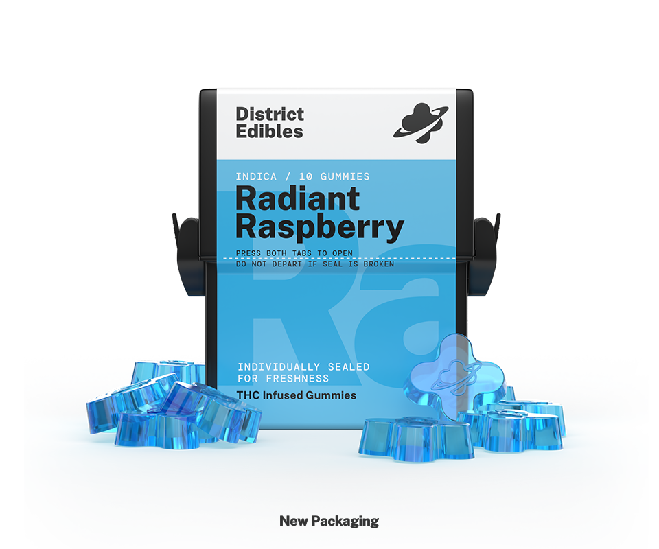
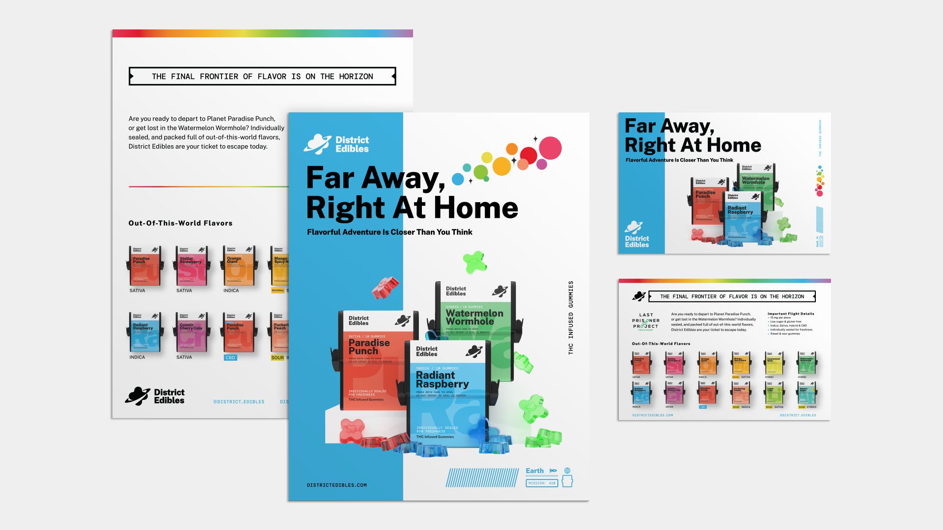
Virtual photography (3D model & scene creation using C4D and Dimension)
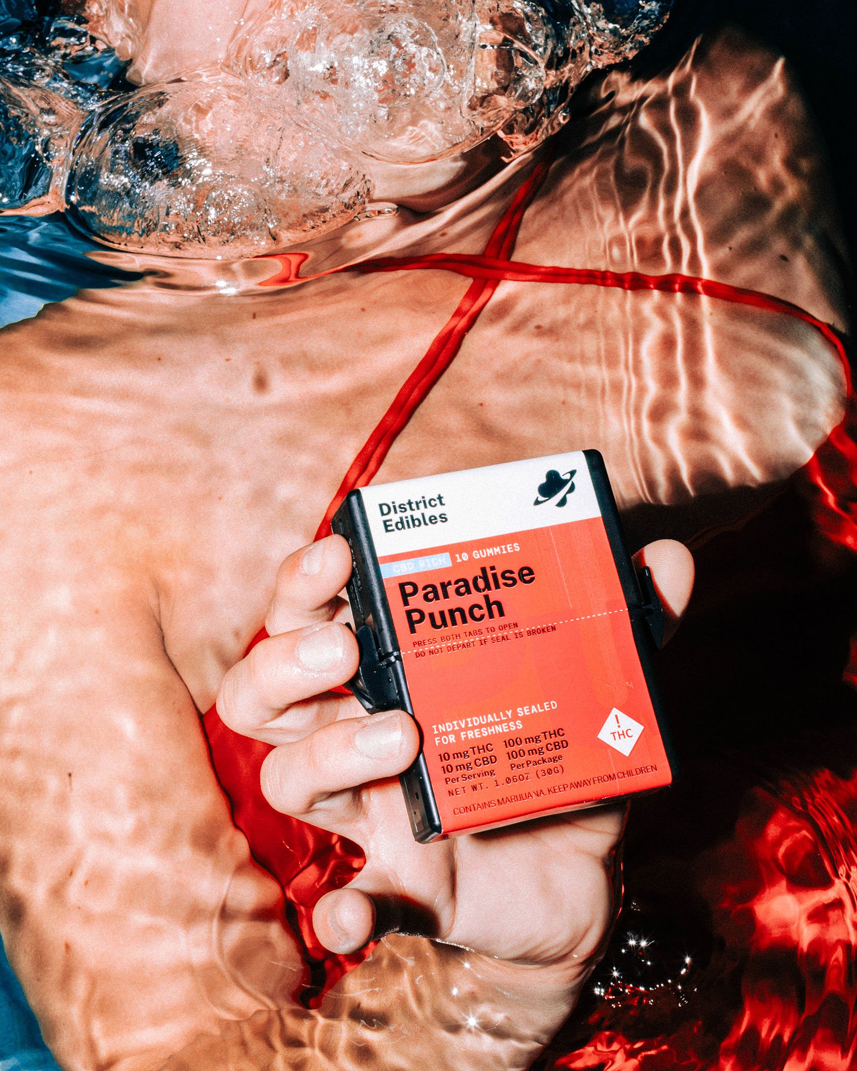
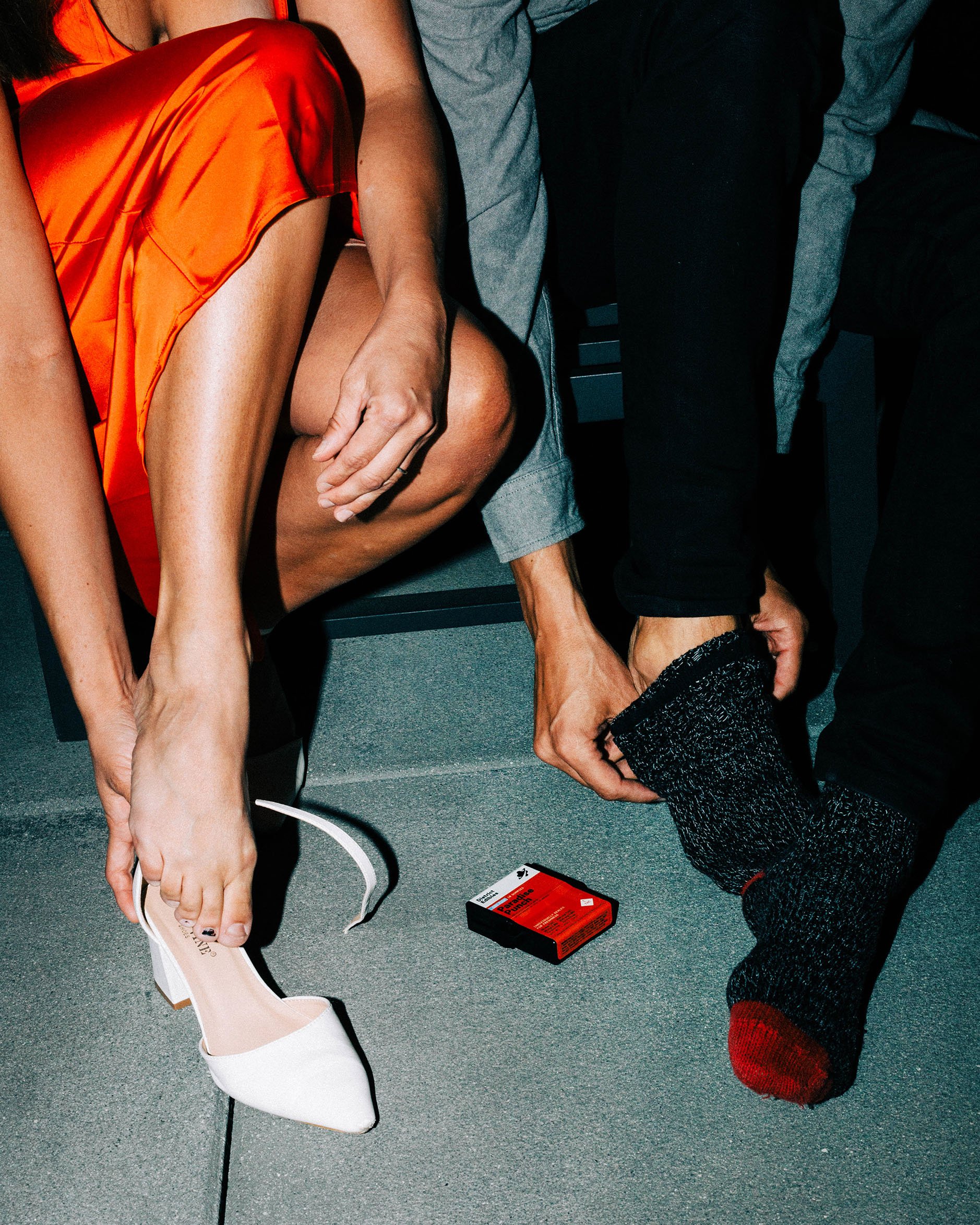
Lifestyle photo shoots
Social media creative direction
In-store displays and promotional materials
Event displays
BACKGROUND
District Edibles is a value-driven brand that has seen success early on as a pioneer in the edible space. However, the brand lost its impact on the shelves due to competition growth and product saturation in the consumer packaged edible goods segment.
As part of the Slang Worldwide team, I led the rebrand of the District Edibles brand. My team consisted of three graphic designers, one 3D artist, and three marketing managers.
GOAL
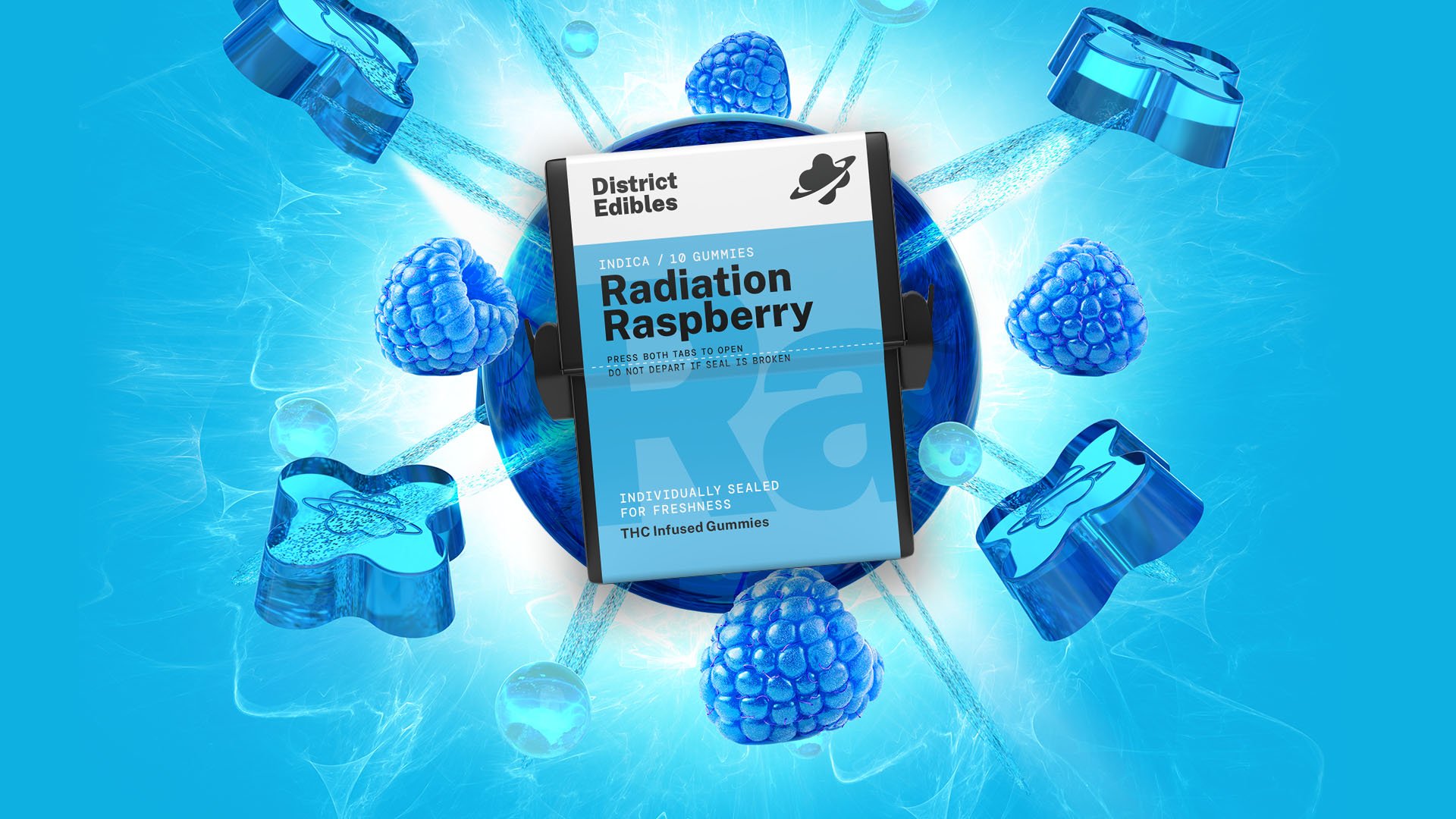
Our goal was to create more taste appeal through visuals and colors, while strengthening the product presence on shelves. We envisioned District Edibles as a way for consumers to escape their current space and travel to “flavor destination planets”. We needed the packaging and brand components to reflect this theme.
SOLUTION
The brand is positioned as a value-based escape from Planet Earth. We created a strategy on how to align the brand with our space and planetary theme. We started with refreshing the logo to better align it with space theme. We carefully selected a type face that fit the escape to space theme. Since we wanted the consumers to travel to these “flavor destinations”, the selected font face had elements reminiscent of travel signs.
For our packaging, we created a systematic approach to the flavors with the goal of having each flavor feel like a different planet or route that the consumer could escape to. To help bring more pop on the shelves and to increase the taste appeal, we expanded the color palette to rainbow theme. Each color also connects to the color of the gummy inside of the package.
For imagery, we produced the product photos through virtual photography. This process allowed us to have more flexibility with usage while simplifying the steps needed to create stunning photos of each product. For lifestyle, we wanted to contrast the clean bold design with hard flash photos that felt like they came right from a disposable camera. We wanted to emphasize “living in the moment” and escaping from reality with the photos.